
Color is a fundamental component of accessible site design. You’ll need to make sure to contrast your text with background, stay mindful of color-blind viewers, and test your site’s appearance under a variety of conditions. Below we’ll cover some of the fundamentals of accessible color palettes so you can keep your site readable.
- Color Contrast: The Foundation of Accessible Color Palettes
- Designing for the Color Blind
- Other Design Considerations
- Testing it Out
Color Contrast: The Foundation of Accessible Color Palettes
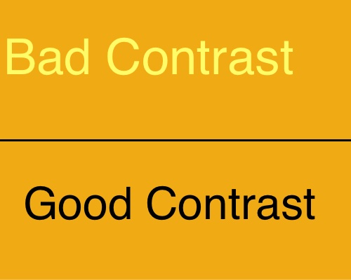
When choosing website colors for accessibility, your primary consideration should be color contrast. The idea here is to select readable colors which have very different hues or shades. You’ll normally want one brighter color and one darker color, so they stand out from each other. If the text and background are contrasting colors, then the text will be easier to read.
Color contrast is measured in terms of relative luminance by comparing the brightness of two colors. The great possible contrast ratio is 21 — which is the relative luminance between white and black.
Where Color Contrast Matters
Text and background color contrast isn’t simply an aesthetic guideline. Providing clear, readable text in a contrasting color helps visitors to your site read easily. Contrast is a fundamental component of various accessibility standards; The WCAG requires normal text to have a contrast ratio of at least 7 to 1.
You also need to make sure that important, usable features like forms, buttons, sliders, and other interactive areas are clearly contrasted from the background. Think of color contrast like a roadmap, directing the attention of your site visitors to what’s important. Link color contrast is also important, with the WCAG recommending that links contrast both the regular text on a page and the page’s background color. Use the web accessibility organization WebAIM’s Link Contrast Checker if you want to see how your site’s links stack up to standard accessibility recommendations.
Designing for the Color Blind
Color blindness is a major accessibility concern, as it occurs in five to eight percent of men and around one percent of women. Color blindness makes certain colors difficult to distinguish — red-green color blindness is the most common, but other forms such as blue-yellow color blindness exist.
As a rule, avoid using color combinations for essential site elements that are difficult for the color blind to distinguish. For example, don’t put red text on a green background.
If you’re planning out your site’s design, it’s worth running your logos, charts, and overall design through a Color Blindness Simulator. These tools will help you avoid problematic color combinations early in the design process.
Color combinations to avoid in important components include red-green, blue-green, yellow-red,
blue-yellow, and purple-red. You can still use these for decorative purposes, just make sure distinguishing between them isn’t required for anything essential.
Other Design Considerations
Prioritize the Meaningful
Focus on providing contrast for informative text and interactive items like buttons, links, and form-fillable boxes. There’s nothing wrong with using similar colors and a subdued color scheme for purely decorative portions of your page. Just be absolutely certain that the most important, interactive portions of your website are accessible — and check that the decorative portions don’t get in the way!
Aim for Color Independence
Don’t rely on color alone to distinguish information or features on your site. Have you ever noticed how graphs will frequently include dots, stripes, or other distinguishing features in addition to a color code? How about the way articles on our site display code samples?
print("hello, world!")
The text is a different color, yes, but it also uses a different font, along with highlighting. Those style changes are independent of the color change — and are still distinguishable even when the color is not.
Testing it Out
Is Your Site Readable in Grayscale?
Use a browser extension or a plugin like One Click Accessibility to check out how your site looks in grayscale. Without color, can you still easily distinguish what everything does? Do your links still stand out? A quick review early in your site design process can save you trouble later on.
Be Mindful of Lighting
Some color combinations that look fine in a well lit office won’t be nearly as readable in other lighting conditions. Imagine that you’ve built the most aesthetically pleasing website for an insurance company. The warm pastels for the site looked great on your high end laptop with a 4k display, but how will the text stand out on a cheap phone under the noon day sun? If your customers are likely to call upon your site under a variety of lighting conditions, test your site out under those conditions across a variety of devices.