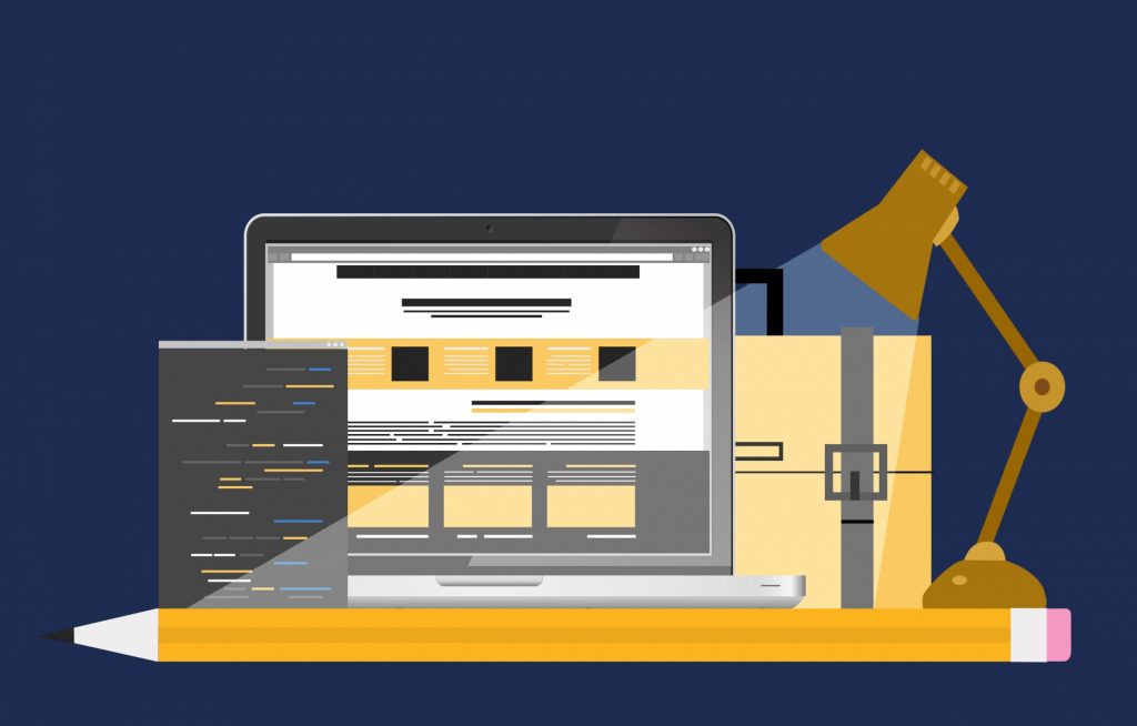
With a new year, many companies look at their websites and think: “Maybe we should do a little renovating. But, where to start?” The problem can be even worse for those just starting out with no idea what makes for an engaging website.
Presenting a visually compelling site leads to greater visitor interest. That, in turn, leads to more time on your pages, higher search rankings, more conversions, and higher revenues. But, what design trends do you need to know about to keep your site looking fresh? Glad you asked. We have compiled this list of the top 5 web design trends to look out for in 2018.
1. Animations
For the last several years, different types of animations have seen greater and greater popularity in modern design. A few recent innovations make them easier for web sites in 2018. They require less bandwidth, less processing power, and load much faster.
One such effect, “particle backgrounds” consist of java script in an HTML5 environment. Unlike fully animated backgrounds of the past, these lightweight effects can add beauty, movement, and interest to your page without taking forever to load. These backgrounds immediately attract attention, causing visitors to linger longer. Well executed, these animations can build credibility in your brand and bring visitors back for repeat performances.
More traditional animations also have a place in the web design playbook for 2018, though. As browsers become more advanced, the ability to implement interesting animations becomes more viable. Smaller animations in areas of interest will draw a lot of attention and can explain something much faster than a paragraph of text or a full-blown video. For example, an animation could show product assembly, show something humorous while the page loads, or integrate in unique ways with navigation and page scrolling.
2. Large Fonts and Empty Space
Many people fear empty space in any kind of design. They should not. Unfortunately, for far too long, the common misconception that every piece of relevant content should fit into the space that first loads on a screen has reigned supreme. The content one sees before scrolling down (an area sometimes called “above the fold”) has lost much of its importance thanks to modern technology. The old wisdom had much more relevance in the age of dial-up connections when users might grow impatient waiting for content to load. As a result, anything not immediately visible risked not getting seen.
Today, pages load in seconds, not minutes. That means visitors are more likely to scroll down your page, particularly if what they see presents a compelling reason to do so. Large, striking fonts and large amounts of empty space can actually create visual appeal and prevent the unhelpful, cluttered, information-overload many sites still use. A custom font can add to this appeal, presenting something interesting and readable, but with a unique feeling immediately evocative of your brand’s identity.
3. Mobile Optimization
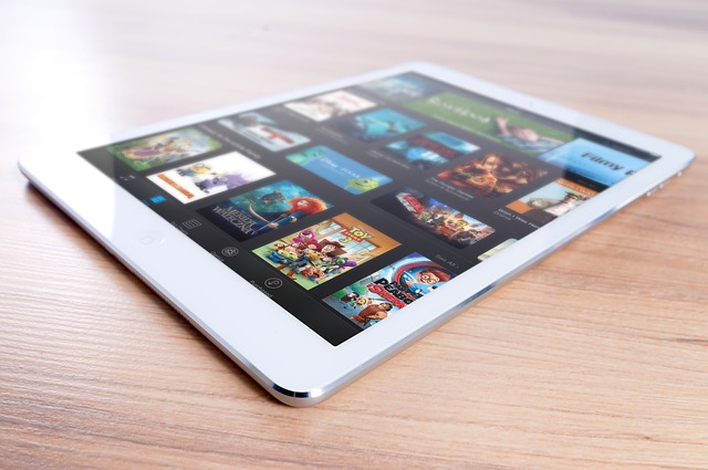
For years now, more and more people have turned to mobile devices to access the Internet. In fact, more people used mobile devices to surf the web in 2017 than desktops and laptops. So, of course, mobile optimization should be a vital part of every web designer’s plan for 2018.
Over the last few years, mobile design has really come into its own. Once, sites either served clunky renderings of their main content or provided stripped-down “mobile optimized” versions. Today, many large and medium sized companies have started adopting a mobile-first strategy for web design. That means designing the site to work best on a mobile device, then scaling it up to suit a desktop. That might mean relying less on large, high-resolution background images, and more on efficient use of space, striking colors, and engaging designs.
4. Colors. Lots and Lots of Colors

As 2017 drew to a close, many sites began using increased color saturation to add pizazz to their pages. After all, in a mobile-first design world, saturating a site with color served as an easy work around for ditching large, high-resolution background images. This trend will continue for 2018.
Once, only a handful of colors were considered “web safe.” Now, with advances in browsers, monitors, and coding languages, a whole spectrum of colors become available to the daring designer. What site visitors see will more closely reflect the vision of the web designer on most monitors and devices. This bold use of color can help to revitalize existing brands that may have become too conservative to appeal to new customers. It can also let newcomers set themselves apart with brilliant and unique new visual palettes.
5. Asymmetry

Finally, an exciting new trend for 2018 will be the liberal use of asymmetry. Asymmetrical images have been popular for many years, and this will continue in 2018. Asymmetrical page layouts, however, will step to the fore in 2018. These unique designs allow for unconventional presentation of content and images. They can draw the eye to points of interest in a way that traditional grid layouts cannot. A slanting column of text could draw attention to an important image or piece of content. Text could wrap around a feature, forcing the viewer to observe it. Indeed, this design practice will make the page itself into a visually appealing work of art.
Beyond actual content layout, asymmetry will also find its way into other elements of the design. This may take the form of backgrounds with unevenly distributed color gradients, creative use of shadowing, or even slashing, jagged visual elements. While symmetry can be beautiful, it has saturated our collective conscience so thoroughly that we no longer find it interesting in websites. Asymmetrical designs, however, may rouse the viewer (however briefly) from the delirium of their usual mindless web surfing and make them really take notice of what your site has to say.
Final Thoughts
Whether you fully embrace new design trends or try out only one, InMotion Hosting ensures your website performs at its best. Partner with a web hosting company that leads the way with the latest enterprise-building tools, technology, and professional expertise to take your business growth to the next level. Explore our web hosting services today!
Great article
Thanks
As a designer of technical and information-based content for many years I have to say that this is all just basic design 101. While these are all good suggestions, the challenge for graphic and information designers is to communicate clearly and effectively without making the medium the message. Use the language of design to control attention, enthusiasm, and focus, and keep your message at the forefront. No mater how bleeding-edge your site is, if your audience does not retain the desired information after leaving your site, you have lost the battle.
Mobile first design… Oh ya, it
1) actually simplifies and speeds up the design process, and
2) forces an organization to finally answer the hard questions like “what really matters?” or “what is our site’s purpose?” (because that the only thing that fits on the mobile screen).
A skeptic, here. If your Web site is your primary product, then perhaps razzle-dazzle stuff like this could lure visitors. If, OTOH, the site is a portal to your business, you would do well to: 1) determine what visitors to the site are seeking, and 2) make it as easy possible for them to find it.
If I visit your site, I’m there to get something, not to be wowed by the creatvity of it’s design. Don’t make me resort to a Google search in the hope of finding what i seek after being unable to locate it through the site. And make the site legible to the many people who don’t have perfect eyesight and color vision — that means high contrast colors for critical elements, *particularly* for text. Don’t force me to puzzle out the design logic of your site in order to be able to use it; that might appeal to some people, but I’ll just close the tab and not come back.
big fan of building mobile first, which means more likely (but not necessarily) more accessibility built in. minimalist design also tends to help in this way. blind users for instance prefer using mobile devices which have effective features in smartphones, iphones and ipads like apple’s voiceover. animations are hard to make accesible, but you can put a script in the alt tag image to describe what’s in the image. adding captions to videos and alt tags in images and straying from complicated confusing images and videos without captions are unacceptable and not section 508 compliant. accessibility of course should not be a trend but second nature. www.leonardorcamargo.com
Good tips. Links to example web sites would be helpful.