InMotion Hosting now offers increased RAM, advanced SSD storage options, and expanded bandwidth on its VPS Hosting plans as of April 22nd, 2024. These updates aim to provide better performance for new customers at competitive prices.
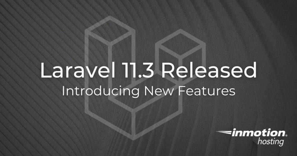
Laravel released Laravel 11.3 this week which includes several exciting features designed to enhance your development workflow. These features include multi-line textarea input in Laravel Prompts, pull and pullHidden() methods, and hasAny method for enhanced session management.
With all the different types of web hosting available, it can be confusing as to which one is right for you. Do you choose Shared Hosting, Managed VPS Hosting, or a Dedicated web hosting plan? You may just be wondering what a VPS or Shared Hosting is.
InMotion Hosting is pleased to announce a new partnership with Codeable, a distinguished freelancer platform specializing in WordPress development. This collaboration aims to give InMotion Hosting customers access to an elite network of WordPress and WooCommerce professionals, adept at handling projects of varying sizes and complexities.
InMotion Hosting is proud to win the Winter 2024 Leader award from SourceForge, the world’s largest software reviews and comparison website.
This prestigious award highlights InMotion Hosting’s commitment to excellence and places it in the top fifth percentile of highly-reviewed products on SourceForge.
With technology evolving, website design is no exception. As we look ahead to web design trends in 2024, several emerging trends are popping up everywhere.
For instance, 67% of companies in the U.S. agree that adopting AI technology has helped create better customer experiences. From cutting-edge AI tools to innovative layouts, the future of web design is shaping up to be exciting for designers.
Laravel 11, launched on March 12, 2024, marks a significant update to the Laravel framework, introducing a range of new features and improvements aimed at enhancing the development experience and application performance. With a focus on efficiency, security, and real-time web application development, Laravel 11 brings forward several key enhancements and introduces Laravel Reverb, a new WebSocket server for real-time communication.
Throughout March, new customers can score exclusive deals and premium features for web hosting. These deals are exclusive to new customer accounts and expire on March 31, 2024, at 12:00pm PST.
Choosing the right type of server for your website or application is a critical decision that can significantly impact its performance, security, and scalability. If you’re at the crossroads of deciding between a Linux VPS and a Windows VPS, you might feel overwhelmed, especially if you’re a beginner in the world of web hosting and server management.
Control Web Panel (CWP) is now available for InMotion Hosting’s VPS and Dedicated Server plans.
InMotion Hosting, the industry leader in premium web hosting and customer support, announced today that it will offer various control panel options for VPS Hosting and Dedicated Servers. Customers can choose from Control Web Panel (CWP) or cPanel®, and purchase these directly through InMotion Hosting.
When it comes to choosing a platform for an online store, the ecommerce landscape is more competitive than ever. Businesses constantly search for the most efficient, scalable, and secure platforms to build their online stores. Enter Laravel – a PHP framework that has gained immense popularity for its elegant syntax, robust features, and versatility. Let’s take a look into the reasons that Laravel is the preferred choice for ecommerce development, offering insights into its ecosystem, security features, and how you can leverage it to build a successful online store.
Starting a website or improving your current hosting can be a bit overwhelming. The choice between different VPS hosting solutions is crucial. Whether you’re a newcomer bringing your business online or seeking an advanced solution, this guide aims to demystify the complexities. It offers clarity on which option suits your unique needs between a managed vs an unmanaged VPS.
On December 20th, 2023, InMotion Hosting and our family of brands made a switch to a new asynchronous messaging.
Since that time, we have been testing and updating our Helpdesk to make your experience with our services better. However, after carefully evaluating your feedback, we’ve realized that this change has not provided the support and convenience we aim for.
Laravel is celebrated for its elegance and robustness, providing developers with an expressive syntax that makes web development not just easier, but truly enjoyable. While Laravel can thrive in various hosting environments, the choice between shared hosting, VPS, and dedicated servers is pivotal for your application’s performance and scalability. This article explores the advantages and drawbacks of using shared hosting for Laravel projects, guiding developers in making an informed hosting decision.
Get web hosting that grows with your business. Our all-in-one hosting platform gives you everything your website needs to scale - so you can focus on the next big thing for you and your business.